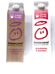
As my task was to brand a drinks company/product i found myself looking to food and drinks brands around me for inspiration, as i came to the conclusion that my brand was going to be a fruit juice/smoothie drink i looked at brands that would be its potential competition, such as innocent smoothies, this juicy water, tropicana, vitamin water and stores own brand of juices and smoothies. these brands all have a very different style, from both a graphic design and a business strategy point of view, they all seem to have a slightly different target audiences, innocent smoothies seem to be targeted more towards young people/children, possibly aged 7-14 ish (to promote health in younger people), whereas ‘this juicy water’ is targeted more towards adults/adolescents and some younger ages possibly aged 16+, this doesn’t mean that young children shouldn’t buy this, but should be encouraged to consume it, this is because the style is marketed toward the adult who would be buying the product and not the consumer.
Innocent Drinks has grown from a three-person outfit to a multimillion pound business, a large part of the company’s success can be attributed to the brand’s tone of voice. It has managed to stand out in a saturated drinks market by being friendly and engaging, sometimes even cheeky but always distinctive. It has managed to elevate the brand way above it’s competitors. Airey (2013) – http://www.davidairey.com/colour-in-brand-identity/


looking at the graphical styles of all of the other juice and smoothie brands helped me gain insight on how to brand the product to the target audience of my choice, but looking solely at these could influence my designs so that the look very similar to my brands competition, which would make the brand invisible and insignificant, it is for this reason that i began to look at the graphic styles of other product, i looked at brands that had a similar brand aesthetic and motive, brands that had a similar target audience and other packaging that i found inspirational. I looked at ‘Bear fruit’ for insight on how to brand fruit effectively to young people, there use of colour is very bold and bright, this makes it stand out on the shelf and draws the consumer to buy the product rather than a chocolate bar or sweets, i have the same task to accomplish but against sugary soft drinks, i also took a lot of inspiration from there use typography, they use only san-serif typefaces but all words seem to be hand-written and custom, the only piece of type that is bold and crisp is the logo, “BEAR” that has the eye of the letters ‘B’, ‘A’ and ‘R’ filled in, the logo also blends into the background as it is the same colour as the packaging.


